
Orbit UI
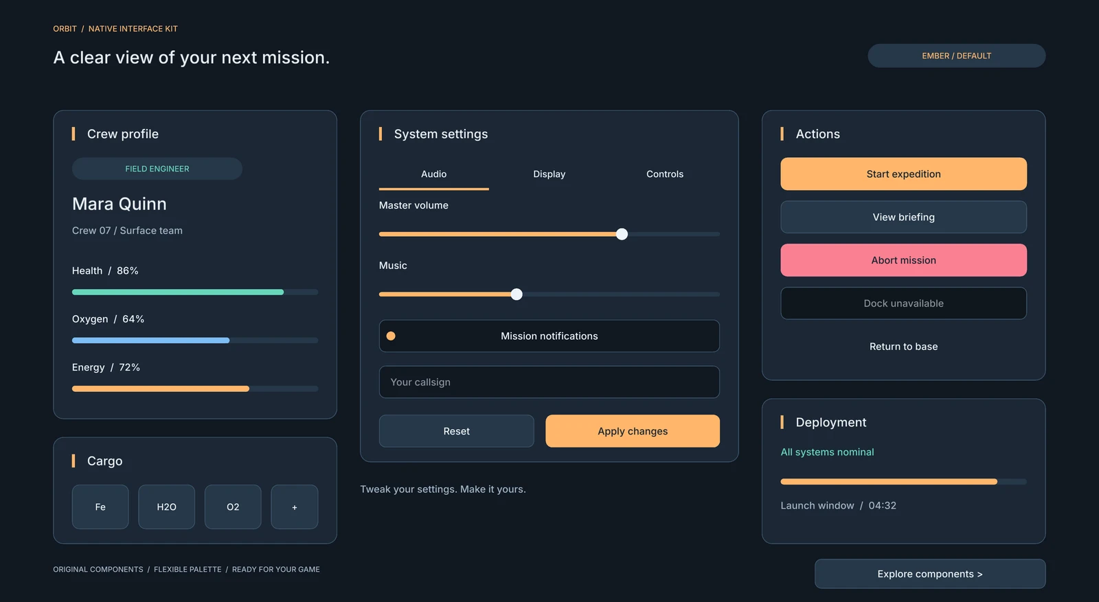
39 original native UI prefabs and compositions for DemiEngine: dark navy surfaces, warm amber highlights, clear typography, rounded controls, and editable colors. Includes 32 original tintable SVG icons and uses the engine's built-in font. No third-party UI artwork is included. BSD-3-Clause; redistribution and modification are permitted under LICENSE.
Requires the development engine with target-based UI overrides and node-owned UI actions. Update the engine and package together; 1.0.0 used root-only overrides.
Install and use in the editor
demi package add demi.ui.orbit@1.1.0 --project path/to/game
Open a HUD in the editor. Installed prefabs appear in UI Palette. Insert a prefab and edit its parameters in the Inspector. The same definitions also work in hand-authored HUD JSON:
{
  "format_version": 1,
  "canvas_size": [1160, 810],
  "children": [{
    "id": "launch",
    "prefab": "ui-prefab://orbit/button-primary",
    "arguments": {"label": "Launch", "accent": "#7DCBFF"},
    "overrides": {"$root": {"dock": "bottom", "margin": [24, 0, 24, 24]}}
  }]
}
Choose a unique instance ID. Descendants use that ID as a prefix: settings.tabs.tab1.
Keep ui-prefab://orbit/... references; do not reference installed cache paths.
The ui/orbit/*.ui.prefab.json parameter blocks describe every supported argument,
its type and default. Use overrides["$root"] for root layout and overrides[local_id] for
descendants; use arguments for shared parameters such as content and colors. Docking, anchors, padding and stacks remain ordinary engine layout.
Headers put the title and accent in one docked row, so resizing keeps them aligned.
Create the same UI from Lua
local Hud = require("demi.hud")
local Orbit = require("demi.ui.orbit")

local palette = Orbit.palette("glacier", { accent = "#83D5FF" })
local button = Orbit.button("launch", "Launch", {palette = palette})
button.overrides = {["$root"] = {dock = "bottom", margin = {24, 0, 24, 24}}}
local handle, error = Hud.create("ui_root", button)
assert(handle, error)
Orbit.node(kind, id, arguments?, palette?) creates a prefab definition;
Orbit.button(id, label, options?) selects a button variant (primary, secondary,
danger, quiet). These factories do not create live nodes until Hud.create.
Creation expands the same prefab as authored HUDs, validates the whole subtree,
and rolls back on duplicate IDs or invalid input. Remove the returned handle with
Hud.remove(handle).
Components
| Group | Prefab names |
|---|---|
| Actions | button-primary, button-secondary, button-danger, button-quiet |
| Forms | input, search, checkbox, toggle, slider, dropdown, radio-group, stepper |
| Navigation | tabs, segmented, pagination |
| Status | badge, metric, progress, status-bar, notification, tooltip |
| Icons | icon, icon-button, button-with-icon, icon-gallery |
| Structure | panel, heading, label, divider, list-row, slot, inventory-slot |
| Compositions | settings, dialog, modal, inventory, main-menu, showcase, components |
showcase and components are complete 1160 × 810 galleries. settings has
Audio, Display and Controls pages. main-menu and inventory are starting layouts;
gameplay, persistence and inventory data remain your game's responsibility.
Colors
Orbit.palette() returns a fresh copy of the default ember palette. glacier
and meadow provide blue and green alternatives. Override any named color with
#RRGGBB or #RRGGBBAA. A factory passes only colors supported by its prefab.
| Color | Default | Use |
|---|---|---|
background |
#101822 |
Canvas and inset fields |
surface |
#1B2735 |
Panels |
raised |
#263748 |
Secondary controls |
stroke |
#3B5166 |
Borders |
text |
#EEF4FA |
Main text |
muted |
#A3B5C5 |
Secondary text |
accent |
#FFB66B |
Primary actions and selected state |
accent_hover |
#FFD09A |
Primary hover |
on_accent |
#19232F |
Text on accent |
positive |
#67D7BB |
Positive status |
negative |
#FA8093 |
Destructive actions |
Palettes apply at creation. To recolor existing controls, use native HUD setters or recreate that subtree. Check contrast after changing colors.
Icons
32 original SVG icons ship with stable asset://orbit/icons/<name> IDs. Their
white masks take a native image node's tint; scale them through size. Use the
icon, icon-button, button-with-icon and icon-gallery prefabs in the editor.
The SVG files are also usable outside DemiEngine under the package's BSD license.
local definition = Orbit.icon("power_status", "energy", {
    size = {32, 32}, tint = "#67D7BB",
})
local button = Orbit.icon_button("settings", "settings", "Open settings", {
    action = "menu.settings", palette = Orbit.palette("glacier"),
})
local save = Orbit.node("button-with-icon", "save", {
    texture = Orbit.icon_asset("save"), label = "Save changes",
})
Pass your own asset:// reference as the texture argument to any of these
prefabs. Give icon-only interactive controls an accessible label; decorative
icons inside buttons are hidden from accessibility traversal. Icons use the
engine's existing SVG importer/renderer capability, with no custom Lua decoder.
Only icons referenced by the active HUD need to load; installing the package
does not add every icon to project startup preload.
Included names: arrow-right, arrow-left, chevron-down, chevron-right, check, close, plus, minus, search, menu, home, settings, user, crew, info, warning, bell, power, play, pause, save, folder, download, upload, trash, lock, heart, water, energy, cargo, globe, rocket.
Compound-control behavior
Native buttons, inputs, sliders, toggles and declarative tabs work without package
controllers. Tabs can also switch pages in the HUD editor without Play.
Bind compound controls once in on_start, and dispose them in on_destroy:
function Menu:on_start()
    self.tabs = Orbit.bind_tabs("settings.tabs", {
        selected = 1,
        on_change = function(index) print("Page", index) end,
    })
    self.quality = Orbit.bind_dropdown("settings.quality", {selected = 2})
    self.controls = Orbit.bind_choices("settings.controls")
end

function Menu:on_destroy()
    self.tabs:dispose()
    self.quality:dispose()
    self.controls:dispose()
end
| Binding | Options and operations |
|---|---|
bind_tabs(id, options?) |
selected, optional panels, on_change(index); :select(index), .value. Also binds segmented. |
bind_dropdown(id, options?) |
selected, on_change(index, text); :select(index), :open(bool), .value, .opened. Outside click or Cancel closes it. |
bind_choices(id, options?) |
selected, on_change(index); :select(index), .value. Binds exclusive radio-group. |
bind_stepper(id, options?) |
minimum, maximum, step, value, on_change(value); :set(value), .value. |
bind_pagination(id, options?) |
pages, selected, on_change(page); :select(page), .value. Shows a moving window of three pages. |
bind_tooltip(triggerId, tooltipId) |
Shows on pointer entry or keyboard focus; hides on exit, blur or Cancel. |
bind_dismiss(id, options?) |
Close button hides the notification; on_change(false). |
bind_dialog(id, options?) |
Starts hidden; :open(), :close(confirmed), .opened, on_change(confirmed). |
All bindings return :dispose(). Dropdown disposal also removes its temporary
outside-click backdrop. Selection/value bindings call on_change during initial
selection and subsequent explicit selection, including selecting the same value.
Tabs, segmented controls, radio groups and dropdowns have three entries in these
starter prefabs; customize the prefab and binding together for another count.
Pagination supports any positive integer page count.
Listen for ui_event submit for button activation; a pointer click emits both
press and submit, so handling both as activation runs an action twice. Native focus
navigation, hover, disabled state and text editing remain engine responsibilities.
Do not bind the same compound instance more than once.
Preview and tests
The engine checkout contains examples/orbit_ui with three interactive galleries,
a blue palette example, a menu and an inventory layout:
demi run --project examples/orbit_ui --window-size 1160x810
demi test linux --project examples/orbit_ui
demi package test packages/sources/demi.ui.orbit
The Components gallery links to the complete icon gallery. The example script demonstrates subscriptions, control cleanup and runtime creation. The galleries are templates for a game interface, not a complete game or inventory system. Layouts use native nodes with original SVG icon assets; no reference-image asset is included in this package.
Authoring inactive pages and local content
Click a settings tab in the HUD view to reveal its page. The preview uses the same declarative show/hide actions as the runtime, without running gameplay Lua. Preview visibility is not saved and does not enter Undo history; Reset preview state restores the authored page. It survives editing the page's content.
One map handles instance changes:
"overrides": {
  "$root": {"size": [400, 440]},
  "title": {"text": "Colony settings"},
  "display_page": {
    "children": [{"id": "custom_hint", "type": "label", "text": "Local content", "size": [200, 30]}]
  },
  "alerts": null
}
Targets must exist in the chosen prefab; unknown IDs are errors. Local additions use stable host-document IDs and may contain further prefab instances. Moving them between prefab containers preserves those IDs. In the Inspector, Reset restores inherited property values; the owning instance provides Restore for removed nodes. Adding/removing local content is undoable and never rewrites the installed package source.
The settings prefab declares page actions alongside the tabs prefab's
indicator actions. The engine namespaces both together. Orbit.bind_tabs adds
selection state/callbacks and programmatic :select; it is not required merely
to switch the authored pages. Optional external panels remain a runtime binding
for custom content; declare matching action effects to preview that content in
the editor. Native Hud.apply_action is also available directly.
Drag children between containers in Hierarchy to reorganize a view, including across prefab instances. Inherited children keep their link and receive a parent override; parent and action references in overrides use host-document IDs. Choose Unpack Prefab in Hierarchy or Inspector for independent editable content. This bakes the owning instance and nested prefabs with their authored overrides, preserves IDs and references, and supports Undo. Temporary tab-preview state is not saved into the unpacked nodes.